ShopDreamUp AI ArtDreamUp
Deviation Actions


Suggested Deviants


![Recall the Time of No Return[Eng] - page 121](https://images-wixmp-ed30a86b8c4ca887773594c2.wixmp.com/f/640e1367-9a8e-40d8-a95c-29a6944fb325/d9xcsg9-43944873-6a07-4ea6-8edb-ee09c8840e4e.png/v1/crop/w_184,h_184,x_0,y_19,scl_0.063579820317899,q_70,strp/recall_the_time_of_no_return_eng____page_121_by_gashiboka_d9xcsg9-92s-2x.jpg?token=eyJ0eXAiOiJKV1QiLCJhbGciOiJIUzI1NiJ9.eyJzdWIiOiJ1cm46YXBwOjdlMGQxODg5ODIyNjQzNzNhNWYwZDQxNWVhMGQyNmUwIiwiaXNzIjoidXJuOmFwcDo3ZTBkMTg4OTgyMjY0MzczYTVmMGQ0MTVlYTBkMjZlMCIsIm9iaiI6W1t7ImhlaWdodCI6Ijw9MTQ0OSIsInBhdGgiOiJcL2ZcLzY0MGUxMzY3LTlhOGUtNDBkOC1hOTVjLTI5YTY5NDRmYjMyNVwvZDl4Y3NnOS00Mzk0NDg3My02YTA3LTRlYTYtOGVkYi1lZTA5Yzg4NDBlNGUucG5nIiwid2lkdGgiOiI8PTEwMjQifV1dLCJhdWQiOlsidXJuOnNlcnZpY2U6aW1hZ2Uub3BlcmF0aW9ucyJdfQ.b0WLfW5Ojw-C6hFe8c4QwuGZ-1RbpCuIddyHdnpz-6Y)
![Recall the Time of No Return[Eng] - page 121](https://images-wixmp-ed30a86b8c4ca887773594c2.wixmp.com/f/640e1367-9a8e-40d8-a95c-29a6944fb325/d9xcsg9-43944873-6a07-4ea6-8edb-ee09c8840e4e.png/v1/crop/w_92,h_92,x_0,y_10,scl_0.03178991015895,q_70,strp/recall_the_time_of_no_return_eng____page_121_by_gashiboka_d9xcsg9-92s.jpg?token=eyJ0eXAiOiJKV1QiLCJhbGciOiJIUzI1NiJ9.eyJzdWIiOiJ1cm46YXBwOjdlMGQxODg5ODIyNjQzNzNhNWYwZDQxNWVhMGQyNmUwIiwiaXNzIjoidXJuOmFwcDo3ZTBkMTg4OTgyMjY0MzczYTVmMGQ0MTVlYTBkMjZlMCIsIm9iaiI6W1t7ImhlaWdodCI6Ijw9MTQ0OSIsInBhdGgiOiJcL2ZcLzY0MGUxMzY3LTlhOGUtNDBkOC1hOTVjLTI5YTY5NDRmYjMyNVwvZDl4Y3NnOS00Mzk0NDg3My02YTA3LTRlYTYtOGVkYi1lZTA5Yzg4NDBlNGUucG5nIiwid2lkdGgiOiI8PTEwMjQifV1dLCJhdWQiOlsidXJuOnNlcnZpY2U6aW1hZ2Uub3BlcmF0aW9ucyJdfQ.b0WLfW5Ojw-C6hFe8c4QwuGZ-1RbpCuIddyHdnpz-6Y)
![Recall the Time of No Return[Eng] - page 93](https://images-wixmp-ed30a86b8c4ca887773594c2.wixmp.com/f/640e1367-9a8e-40d8-a95c-29a6944fb325/d9m0ezv-ef4361e9-734c-4d9b-8474-dff77f2b1836.png/v1/crop/w_184,h_184,x_0,y_19,scl_0.063579820317899,q_70,strp/recall_the_time_of_no_return_eng____page_93_by_gashiboka_d9m0ezv-92s-2x.jpg?token=eyJ0eXAiOiJKV1QiLCJhbGciOiJIUzI1NiJ9.eyJzdWIiOiJ1cm46YXBwOjdlMGQxODg5ODIyNjQzNzNhNWYwZDQxNWVhMGQyNmUwIiwiaXNzIjoidXJuOmFwcDo3ZTBkMTg4OTgyMjY0MzczYTVmMGQ0MTVlYTBkMjZlMCIsIm9iaiI6W1t7ImhlaWdodCI6Ijw9MTQ0OSIsInBhdGgiOiJcL2ZcLzY0MGUxMzY3LTlhOGUtNDBkOC1hOTVjLTI5YTY5NDRmYjMyNVwvZDltMGV6di1lZjQzNjFlOS03MzRjLTRkOWItODQ3NC1kZmY3N2YyYjE4MzYucG5nIiwid2lkdGgiOiI8PTEwMjQifV1dLCJhdWQiOlsidXJuOnNlcnZpY2U6aW1hZ2Uub3BlcmF0aW9ucyJdfQ.8BMrJuBU6HAqhL1mNmBdupnlBTlZHISQLElAdSRgjW8)
![Recall the Time of No Return[Eng] - page 93](https://images-wixmp-ed30a86b8c4ca887773594c2.wixmp.com/f/640e1367-9a8e-40d8-a95c-29a6944fb325/d9m0ezv-ef4361e9-734c-4d9b-8474-dff77f2b1836.png/v1/crop/w_92,h_92,x_0,y_10,scl_0.03178991015895,q_70,strp/recall_the_time_of_no_return_eng____page_93_by_gashiboka_d9m0ezv-92s.jpg?token=eyJ0eXAiOiJKV1QiLCJhbGciOiJIUzI1NiJ9.eyJzdWIiOiJ1cm46YXBwOjdlMGQxODg5ODIyNjQzNzNhNWYwZDQxNWVhMGQyNmUwIiwiaXNzIjoidXJuOmFwcDo3ZTBkMTg4OTgyMjY0MzczYTVmMGQ0MTVlYTBkMjZlMCIsIm9iaiI6W1t7ImhlaWdodCI6Ijw9MTQ0OSIsInBhdGgiOiJcL2ZcLzY0MGUxMzY3LTlhOGUtNDBkOC1hOTVjLTI5YTY5NDRmYjMyNVwvZDltMGV6di1lZjQzNjFlOS03MzRjLTRkOWItODQ3NC1kZmY3N2YyYjE4MzYucG5nIiwid2lkdGgiOiI8PTEwMjQifV1dLCJhdWQiOlsidXJuOnNlcnZpY2U6aW1hZ2Uub3BlcmF0aW9ucyJdfQ.8BMrJuBU6HAqhL1mNmBdupnlBTlZHISQLElAdSRgjW8)
![Recall the Time of No Return[Eng] - page 242](https://images-wixmp-ed30a86b8c4ca887773594c2.wixmp.com/f/640e1367-9a8e-40d8-a95c-29a6944fb325/dbaw84f-56bbca52-9c2e-4a63-83cb-a1767ba890bf.png/v1/crop/w_184,h_184,x_0,y_19,scl_0.063579820317899,q_70,strp/recall_the_time_of_no_return_eng____page_242_by_gashiboka_dbaw84f-92s-2x.jpg?token=eyJ0eXAiOiJKV1QiLCJhbGciOiJIUzI1NiJ9.eyJzdWIiOiJ1cm46YXBwOjdlMGQxODg5ODIyNjQzNzNhNWYwZDQxNWVhMGQyNmUwIiwiaXNzIjoidXJuOmFwcDo3ZTBkMTg4OTgyMjY0MzczYTVmMGQ0MTVlYTBkMjZlMCIsIm9iaiI6W1t7ImhlaWdodCI6Ijw9NDA5MyIsInBhdGgiOiJcL2ZcLzY0MGUxMzY3LTlhOGUtNDBkOC1hOTVjLTI5YTY5NDRmYjMyNVwvZGJhdzg0Zi01NmJiY2E1Mi05YzJlLTRhNjMtODNjYi1hMTc2N2JhODkwYmYucG5nIiwid2lkdGgiOiI8PTI4OTQifV1dLCJhdWQiOlsidXJuOnNlcnZpY2U6aW1hZ2Uub3BlcmF0aW9ucyJdfQ.Z4fjwHOXs-FnXDbInH2RJSRLEX7Lk4xiMAHvD49PB7M)
![Recall the Time of No Return[Eng] - page 242](https://images-wixmp-ed30a86b8c4ca887773594c2.wixmp.com/f/640e1367-9a8e-40d8-a95c-29a6944fb325/dbaw84f-56bbca52-9c2e-4a63-83cb-a1767ba890bf.png/v1/crop/w_92,h_92,x_0,y_10,scl_0.03178991015895,q_70,strp/recall_the_time_of_no_return_eng____page_242_by_gashiboka_dbaw84f-92s.jpg?token=eyJ0eXAiOiJKV1QiLCJhbGciOiJIUzI1NiJ9.eyJzdWIiOiJ1cm46YXBwOjdlMGQxODg5ODIyNjQzNzNhNWYwZDQxNWVhMGQyNmUwIiwiaXNzIjoidXJuOmFwcDo3ZTBkMTg4OTgyMjY0MzczYTVmMGQ0MTVlYTBkMjZlMCIsIm9iaiI6W1t7ImhlaWdodCI6Ijw9NDA5MyIsInBhdGgiOiJcL2ZcLzY0MGUxMzY3LTlhOGUtNDBkOC1hOTVjLTI5YTY5NDRmYjMyNVwvZGJhdzg0Zi01NmJiY2E1Mi05YzJlLTRhNjMtODNjYi1hMTc2N2JhODkwYmYucG5nIiwid2lkdGgiOiI8PTI4OTQifV1dLCJhdWQiOlsidXJuOnNlcnZpY2U6aW1hZ2Uub3BlcmF0aW9ucyJdfQ.Z4fjwHOXs-FnXDbInH2RJSRLEX7Lk4xiMAHvD49PB7M)
Suggested Collections


You Might Like…


Description
If you like what you see, commission me!
Speedpaint here.
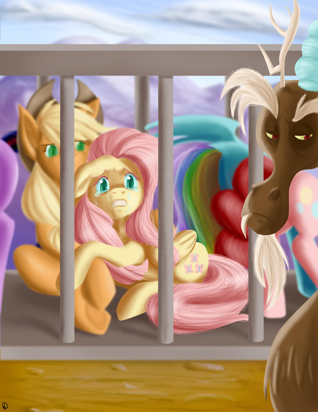
Whew! It's done it's done!! I'm a little breathless when I look at all my captured video and it tells me this only took around 4 hours. It felt like it took forever! Look at how many characters I had to paint; that's over thirty layers of work! *dies* This is one of the most intense projects I've done in a while; I have ambient daylight, the cage (which I obviously didn't spend much though on... I should have taken a screencap of it...), the mountains in the background, the dirt in front... there were so many elements coming together for this that for a while I was worried that I could even do it.
This was my take away from the season finale. Though Mirror is going to bludgeon me if I don't to her takaway, THIS was the moment that my brain always comes back to. Maybe because I'm a Flutters fan... actually it's TOTALLY 'cause I'm a Flutters fan. I was always a little perturbed in the season opener that everyone had lots to do except her. This more than made up for it, and I firmly believe that kindness is the strongest element of harmony - or whatever they're calling that Rainbow of Light mcguffin they've concocted now - even over magic.
As for the piece... well... LOOK AT IT. You have six characters AND a background. I don't think I've done that on before now. I tend not to have more than 2-3 characters in a piece because I have trouble with maintaining consistent height. This was manageable because of the different in foreground and background, and also tthat three of the main characters are only their flanks; with less detail I could focus on their height.
You can also the see the breadth of what I am and am not good at. Given that I've been drawing characters and expressions for years they really shine. I've been painting hair and forms for a couple of years so that's passable. My repeated efforts in mountains and skies have made them passable. But where I haven't practiced and there for FAIL at is the cage and the ground. The ground it all one color with minimal detail and it just sort of there, while the cage is decidedly flat in design because it's a front-facing angle with minimal perspective. The only thing interesting about it is the floor because of some of the lighting, but it doesn't stand out at all, and serves as a barrier between Fluttershy and Discord - which is the point of course, but here it's flat and a distraction instead of an enhancement of the scene. It just looks so FLAT, even with the shading. Someday I will actually remember to have reference pics handy to try and pull from in order to make the piece better.
I'm also not completely convinced of the composition of this piece. The eye doesn't move very well and that's once again because of the plain straight-on approach. However good certain aspect of this piece are, I fear the drawbacks almost ruin the piece.")
So:
What I like: the expressions, Flutters in general, RD's tail, the mountains, AJ's hooves.
What I don't like: the cage, the ground, the composition.
As always, let me know what you think!
Speedpaint here.
Whew! It's done it's done!! I'm a little breathless when I look at all my captured video and it tells me this only took around 4 hours. It felt like it took forever! Look at how many characters I had to paint; that's over thirty layers of work! *dies* This is one of the most intense projects I've done in a while; I have ambient daylight, the cage (which I obviously didn't spend much though on... I should have taken a screencap of it...), the mountains in the background, the dirt in front... there were so many elements coming together for this that for a while I was worried that I could even do it.
This was my take away from the season finale. Though Mirror is going to bludgeon me if I don't to her takaway, THIS was the moment that my brain always comes back to. Maybe because I'm a Flutters fan... actually it's TOTALLY 'cause I'm a Flutters fan. I was always a little perturbed in the season opener that everyone had lots to do except her. This more than made up for it, and I firmly believe that kindness is the strongest element of harmony - or whatever they're calling that Rainbow of Light mcguffin they've concocted now - even over magic.
As for the piece... well... LOOK AT IT. You have six characters AND a background. I don't think I've done that on
You can also the see the breadth of what I am and am not good at. Given that I've been drawing characters and expressions for years they really shine. I've been painting hair and forms for a couple of years so that's passable. My repeated efforts in mountains and skies have made them passable. But where I haven't practiced and there for FAIL at is the cage and the ground. The ground it all one color with minimal detail and it just sort of there, while the cage is decidedly flat in design because it's a front-facing angle with minimal perspective. The only thing interesting about it is the floor because of some of the lighting, but it doesn't stand out at all, and serves as a barrier between Fluttershy and Discord - which is the point of course, but here it's flat and a distraction instead of an enhancement of the scene. It just looks so FLAT, even with the shading. Someday I will actually remember to have reference pics handy to try and pull from in order to make the piece better.
I'm also not completely convinced of the composition of this piece. The eye doesn't move very well and that's once again because of the plain straight-on approach. However good certain aspect of this piece are, I fear the drawbacks almost ruin the piece.
So:
What I like: the expressions, Flutters in general, RD's tail, the mountains, AJ's hooves.
What I don't like: the cage, the ground, the composition.
As always, let me know what you think!
Image size
2550x3300px 873.53 KB
© 2014 - 2024 MirrorandImage
Comments19
Join the community to add your comment. Already a deviant? Log In
Poor Fluttershy and Discord doesn't look proud about it at all right there.