ShopDreamUp AI ArtDreamUp
Deviation Actions


Suggested Collections


You Might Like…


Featured in Groups


Description
If you like what you see, commission me!
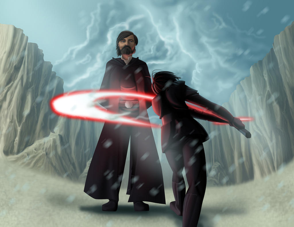
For a Contest. The theme of light and dark - I almost missed the deadline!
The missive was to have the Light and Dark side of the Force, or use if strong light and dark shadows, etc from the Last Jedi. I decided to do one of my favorite moments and layer it with as much light/dark symbolism as I could. THIS TOOK A MONTH TO DO.
And so we have Luke sacrificing himself to Kylo Ren, the moment when dark conquers light, and in doing so light conquers dark. Luke and Kylo are both heavily in black and red, partly because of their costumes but also partly because of the strong light of the lightsaber, and yet they are surrounded by blue and by softer shading and atmospheric distortion, i.e. surrounded by the light side of the Force. Kylo's form is aggressive and active, Luke is passive and stoic, etc.
Mirror just about ordered me to take my time on this and to make it look as realistic as possible. I don't know if I can really DO realistic - I've been doing anime lineart and comic strips for so long that trying to shift back to realism is kind of hard to do, but this is one of my better pushes. Luke's face has a lot of different colors in it, from pink to brown to grey, and the cliffs in back are pretty good. Kylo's hair looks great and so does Luke's beard, so there's a lot to like about the piece. I won't call it perfect, Luke's proportions are a little screwed up because of the fisheye lens look and he looks freakin' tall next to the thrusting Kylo.
What I like: Kylo's hair, Luke's beard, Kylo's stance, the cliffs, the clouds.
What I don't like: Luke's proportions and hair, the lightsaber, Luke's cloak.
As always, let me know what you think!
Image size
3300x2550px 2.28 MB
© 2018 - 2024 MirrorandImage
Comments15
Join the community to add your comment. Already a deviant? Log In
The characters are very well laid out, you really nailed them. Lukes expression is calm, even a bit bored and transports the exact feeling that this scene evoked in me while watching the movie.
You also have a solid grasp of anatomy and form, as your figures look convincing and stylish at the same time. Also, the background which frames your figures offers a lot of details and is done in a very interesting way.
The only thing I would like to point out here, is that you could heighten the color contrasts so that the battle scene gets even more drama, like f.e. use stronger saturation on the blue of the sky and light saber to create a nice "Zak Snyder" color contrast here, add some darker cloud for artistic purpose. Yet, this is only my own preference speaking here. Your image is very well done.